Categories
Demo Math SGI research projects

Incompressible Flows on Meshes

An exploration of computational fluid dynamics

By: Natasha Diederen, Joana Portmann, Lucas Valença

These past two weeks, we have been working with Paul Kry to extend Jos Stam’s work on stable, incompressible fluid flow simulation. Stam’s paper Flows on Surfaces of Arbitrary Topology implements his stable fluid algorithm over patches of Catmull-Clark subdivision surfaces. These surfaces are ideal since they are smooth, can have arbitrary topologies, and have a quad patch parameterisation. However, Catmull-Clark subdivision surfaces are a quite specific class of surface, so we wanted to explore whether a similar algorithm could be implemented on triangle meshes to avoid the subdivision requirement.

Understanding basics of fluid simulation algorithms

We spent the first week of our project coming to terms with the different components of fluid flow simulation, which is based on solving the incompressible Navier-Stokes equation for velocities (1) and a similar advection-diffusion equation for densities (2) \[ \frac{\partial \mathbf{u}}{\partial t} = \mathbf{P} { -(\mathbf{u} \cdot \nabla)\mathbf{u} + \nu \nabla^2 \mathbf{u} + \mathbf{f} }, \quad (1)\] \[\frac{\partial \rho}{\partial t} = -(\mathbf{u} \cdot \nabla)\rho + \kappa \nabla^2 \rho + S, \quad (2)\] where \( \mathbf{u}\) is the velocity vector, \(t\) is time, \(\mathbf{P}\) is the projection operator, \( \nu\) is the viscosity coefficient, \(\mathbf{f}\) are external sources, \( \rho\) is the density scalar, \( \kappa\) is the diffusion coefficient, and \( S \) are the external sources. In the above equations, the Laplacian (often denoted \( \Delta\)) is written as \( \nabla^2\), as is usually done in works from the fluids community.

In his paper, Stam uses a splitting technique to deal with each term on its own. The algorithm carries out the following steps twice: first for the velocities and then for the densities (with no “project” step required for the latter). \[ \mathbf{u_0} {\underset{\overbrace{\text{add force}}^\text{ }}{\Rightarrow}} \mathbf{u_1} {\underset{\overbrace{\text{diffuse}}^\text{ }}{\Rightarrow}} \mathbf{u_2} {\underset{\overbrace{\text{advect}}^\text{ }}{\Rightarrow}} \mathbf{u_3} {\underset{\overbrace{\text{project}}^\text{ }}{\Rightarrow}} \mathbf{u_4} \]

Source: Flows on Surfaces of Arbitrary Topology

We start by adding any forces or sources we require. In the vector case, we can add acceleration forces such as gravity (which changes the velocities) or directly add velocity sources with a fixed location, direction, and intensity. In the scalar case, we add density sources that directly affect other quantities. 

Single density source pouring down with gravity over an initially zero velocity field

Densities and velocities are moved from a high to low concentration in the diffusion step, then moved along the vector field in the advection step. The final projection step ensures incompressible flow (i.e., that mass is conserved), using a Helmholtz-Hodge decomposition to force a divergence-free vector field. We will not go into much more detail on Stam’s original Stable Fluids solver. Dan Piponi’s Papers We Love presentation gives a very comprehensive introduction for those interested in learning more.

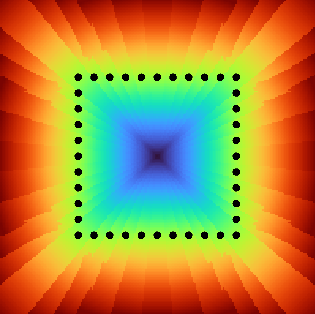
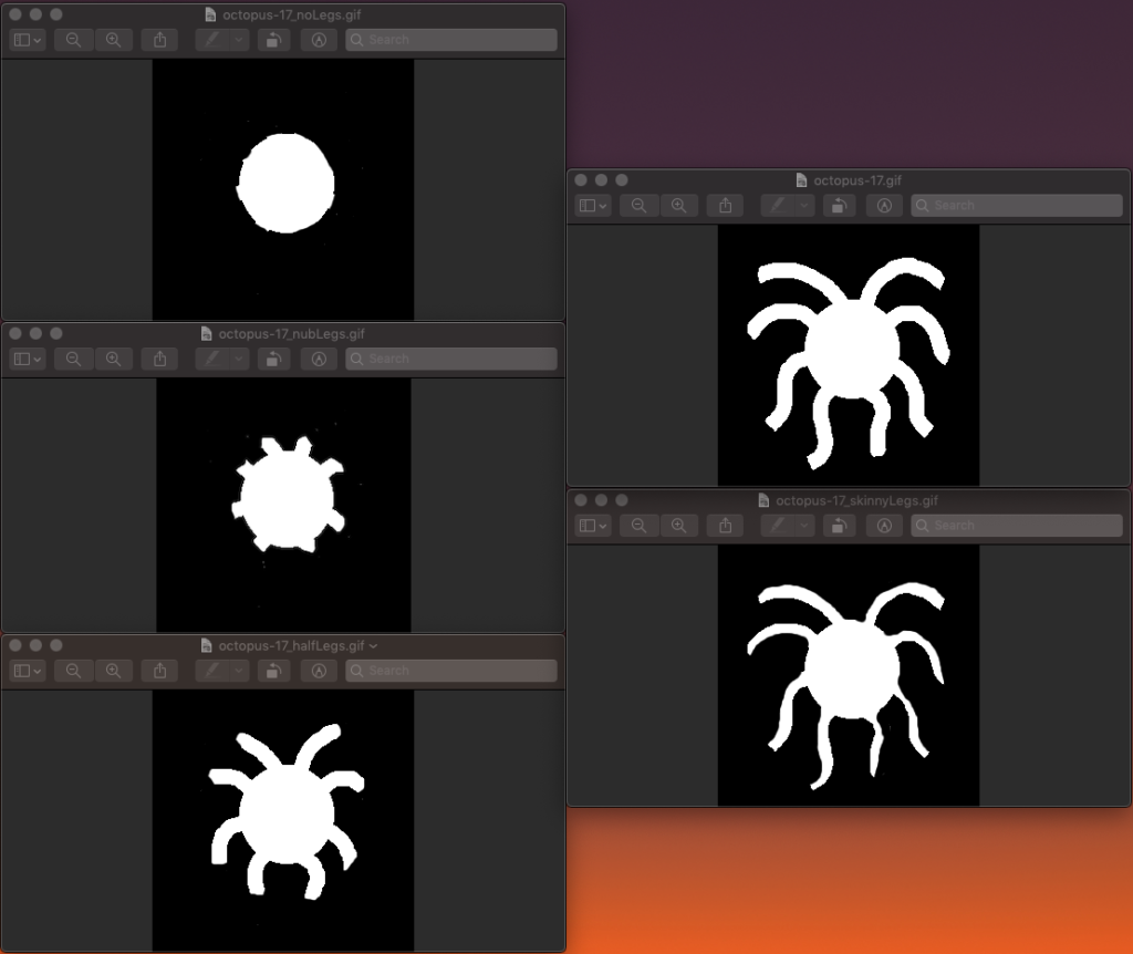
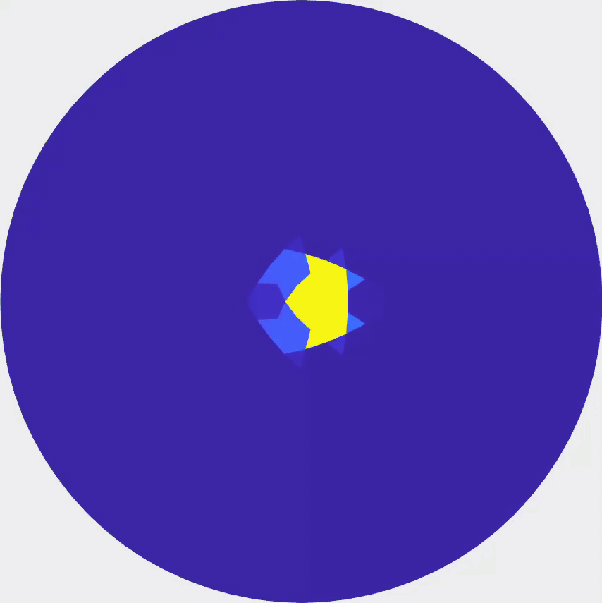
To better understand the square grid fluids solver, we implemented a MATLAB version of the C algorithm described in Stam’s paper Real-Time Fluid Dynamics for Games. In terms of implementation, since we were coding in MATLAB, we did not use the Gauss-Seidel algorithm (like Stam did) to solve the minimisation problems. Instead, we solved our own quadratic formulations directly. Although some of our methods differed from the original, the overall structure of the code remained the same.

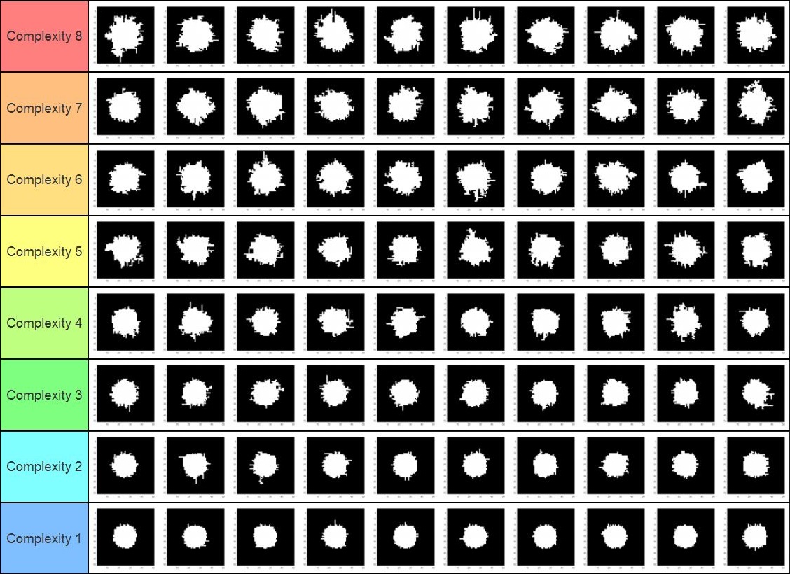
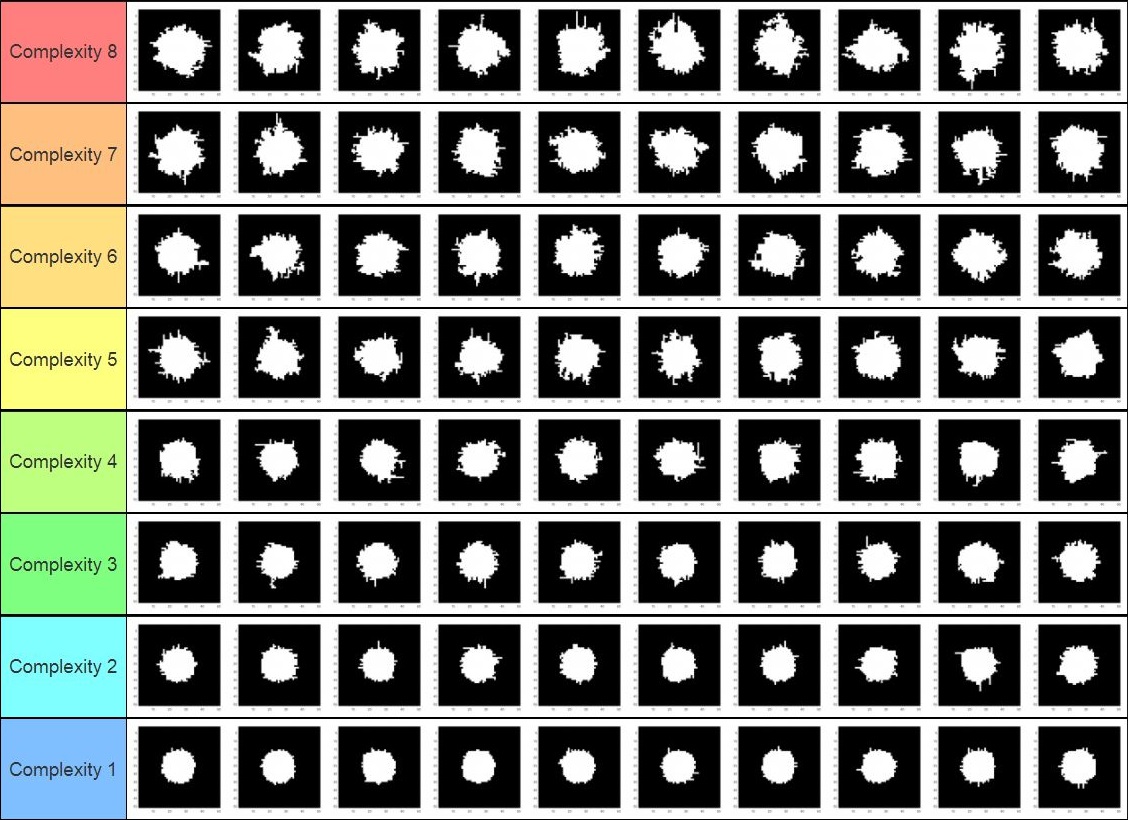
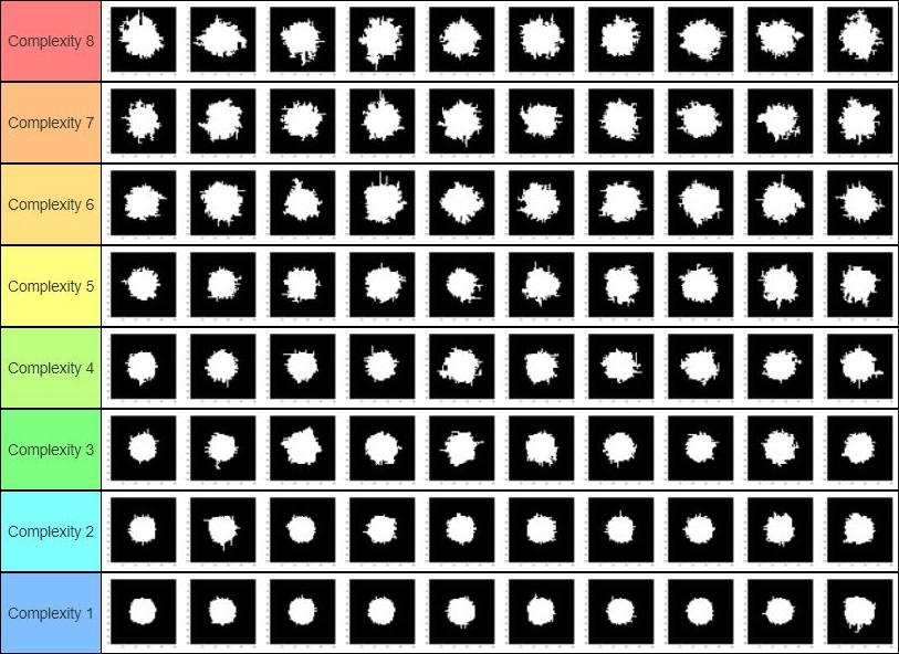
Full simulation results over a square grid can be seen below. 

Generalising to triangle meshes

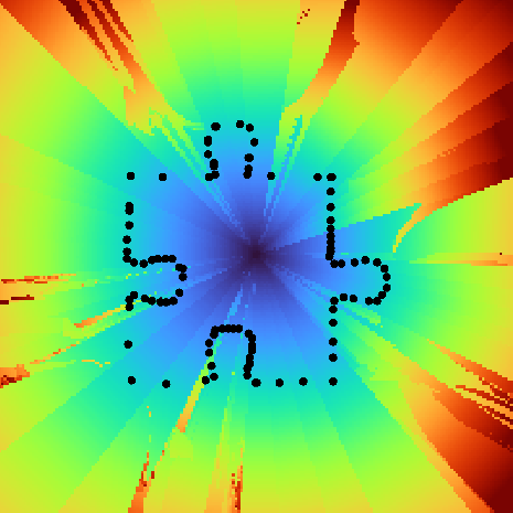
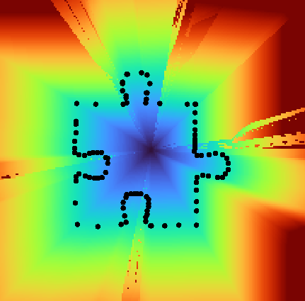
After a week, we understood the stable fluid algorithm well enough to extend it to triangle meshes. Stam’s paper for triangle meshes adapted the algorithm above from square grids to patches of a Catmull-Clark subdivided mesh, with the simulation boundary conditions at the edges of the parametric surfaces. We, on the other hand, wanted a method that would work over any triangular mesh, as long as such mesh, as a whole, is manifold without boundary. Moreover, we wished to do so by working directly with the triangles in the mesh without relying on subdivision surfaces for parameterisation. The main difference between our method and Stam’s was the need to deal with the varying angles between adjacent faces and their effect on advection, diffusion, and overall interpolation. In addition, since we’re working with manifolds without boundaries, we did not need to deal with boundary conditions (like in our 2D implementation). Furthermore, we had to choose between storing both vector and scalar quantities at the barycentre of each face or at each vertex. For simplicity, we chose the former.

What follows is a detailed explanation of how we implemented the three main steps of the fluid system: diffusion, advection and projection.

Diffusion

To diffuse quantities, we solved the equation\[ \dot{\mathbf{u}} = \nu \nabla^2 \mathbf{u},\] which can be discretised using the backwards Euler method for stability as follows \[ (\mathbf{I}-\Delta t \nu \nabla^2)\mathbf{u_2} = \mathbf{u_1}.\] Here, \( \mathbf{I} \) is the identity matrix and \( \mathbf{u_1}, \ \mathbf{u_2} \) are the respective original and final quantities for that iteration step, and can be either densities or vectors.

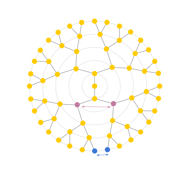
Surprisingly, this was far easier to solve for a triangle mesh than a grid due to the lack of boundary constraints. However, we needed to create our own Laplacian operators. They were used to deal with the transfer of density and velocity information from the barycentre of the current triangle to its three adjacent triangles. The first Laplacian we created was a linear operator that worked on vectors. For each face, before combining that face’s and its neighbours’ vectors with Laplacian weighting, it locally rotated the vectors lying on each of the face’s neighbouring faces. This way, the adjacent faces lay on the same plane as the central one. The rotated vectors were further weighted according to edge length (instead of area weighting) since we thought this would best represent flux across the boundary. The other Laplacian was a similar operator, but it worked on scalars instead of vectors. Thus, it involved weighting but not rotating the values at the barycentres (since they were scalars).

Diffusion of scalars over a flattened icosahedron
Advection

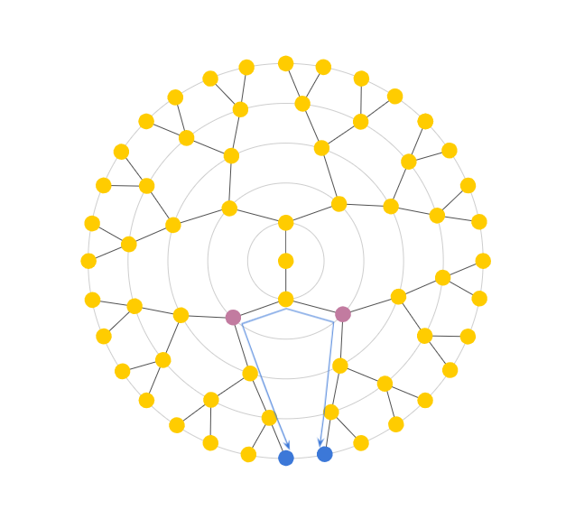
Advection was the most involved part of our code. To ensure the system’s stability, we implemented a linear backtrace method akin to the one in Stam’s Stable Fluids paper. Our approach considered densities and velocities as quantities currently stored at barycentres. It first looked at the current velocity at a chosen face then walked along the geodesic in the opposite direction (i.e., back in time). This allowed us to work out which location on the mesh we started at so that we would arrive at the current face one time-step later. This is analogous to Stam’s 2D walking over a square grid, interpolating quantities at the grid centres, but with a caveat. To walk the geodesics, we first had to use barycentric coordinates to work out the intersections with edges. Each time we crossed an edge, we rotated the walk direction vector from the current face to the next, making it as if we were walking along a plane. At the end of the geodesic, we obtain the previous position for the quantity on our current position. We then carried out a linear interpolation using barycentric coordinates and pre-interpolated vertex data. The result determined the previous value for the quantity in question. This quantity was then transported back to the current position. Vector quantities were also projected back onto the face plane at the end to account for any numerical inaccuracies that may have occurred.

Advection of a density blob over an icosahedron following gravity

Our advection code initially involved walking a geodesic for each mesh face, which is not computationally efficient in MATLAB. Thus, it accounted for the majority of the runtime of our code. The function was then mexed to C++, and the application now runs in real-time for moderately-sized meshes. 

Projection

So far, we have not guaranteed that diffusion and advection will result in incompressible flow. That is, the amount of fluid flowing into a point is the same as the amount of fluid flowing out. Hence, we need some way of creating such a field. According to the Helmholtz-Hodge decomposition, any vector field can be decomposed into curl-free and divergence-free fields, \[ \mathbf{w} = \mathbf{u} + \nabla q, \] where \( \mathbf{w}\) is the velocity field, \( \mathbf{u} \) is the divergence-free component, and \( \nabla q\) is the curl-free component.

A solution (for \(q\)) is implicitly found by solving a Poisson equation of the form \[ \nabla \cdot \mathbf{w} = \nabla^2 q\] where we used the cotangent Laplacian in gptoolbox for \(\nabla^2 q\). Subtracting the solution from the original vector field gives us the projection operator \( \mathbf{P}\) to find the divergence free component \( \mathbf{u} \) \[\mathbf{u} = \mathbf{Pw}=\mathbf{w}-\nabla q. \]

A uniform vector field before (left) and after (right) projection

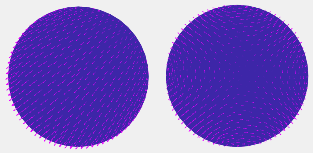
This method works really nicely for our choice of having vector quantities stored at the faces. The pressures we get will be at the vertices. The gradients of those pressures are naturally computed at faces to alter the velocities to give an incompressible field. The only challenge is that the Laplacian is not full rank, so we need to regularise it by a small amount.

Future work

We would like to implement an alternative advection method, possibly more complicated. This method would involve interpolating vertex data and walking along mesh edges, rather than storing all our data in faces and walking geodesics crossing edges. This could possibly avoid extra blurring, which might be introduced by our current implementation. This occurs because we must first interpolate the data at the neighbouring barycenters to the vertices. This data is then used to do a second interpolation back to the barycentric coordinate the geodesic ends at.

For diffusion, although our method worked, there were a few things that could be improved upon. Mainly, diffusion did not look isotropic in cases with very thin triangles, which could be improved by an alternative to our current weighting of the Laplacian operator. Alternatively, we could use a more standard Laplacian operator if we stored quantities at the vertices instead of barycenters. This would result in more uniform diffusion at the expense of a more complicated advection algorithm.

Example of non-isotropic diffusion over a flattened torus

Conclusion

Final results

We would like to give a thousand thanks to Paul Kry for his mentorship. As a first foray into fluid simulations, this started as a very daunting project for us. Still, Paul smoothly led us through it by having dozens of very patient hours of Zoom calls, where we learned a lot about maths and coding (and biking in the rain). His enthusiasm for this project was infectious and is what enabled us to get everything working in such a short period. Still, even though we managed to get a good start on extending Stam’s methods to more general triangle meshes, there is a lot more work to do. Further extensions would focus on the robustness and speed of our algorithms, separation of face and vertex data, and incorporation of more components such as heat data or rotation forces. If anyone would like to view our work and play around with the simulations, here is the link to our GitHub repository. If anybody has any interesting suggestions about other possibilities to move forward, please feel free to reach out to us! 😉

Categories
SGI research projects

Jigsaw

Disclaimer: If you are looking for a technical and mathematical post, this is not the one for you! But if you share a passion for jigsaw as I do, feel free to scroll through and enjoy my 2000-piece jigsaw puzzle below.

“Click” went the sound of the final piece of the 2000-piece puzzle. 4 days, 18 cumulative hours spent, and the result lied magnificently in front of my eyes: a beautiful cozy library underneath a never-ending river—another one goes to the collection.

My proud 2000-piece jigsaw puzzle

Puzzles are my refuge, a much-valued pastime. As I painstakingly classified, searched for pieces, and watched the puzzle slowly come into place, my thoughts ran wild: I marveled at the perfect cut coming from my Ravensburger puzzle set, wondering how a laser-cut could be so clean. That’s why when I came to MIT SGI this summer, my eyes were immediately caught on the project “Optimal Interlocking Parts via Implicit Shape Optimization” by Professor David Levin.

In the project, I learned about the polygonizer technique, with which we tried to cut the puzzle into pieces based on known clusters. The process involves two steps:

  • Firstly, we found points on the cut lines.
  • Secondly, we connected the points above to create shapes for the puzzle pieces.
Simple illustration of polygonizer technique (step 1)

Due to the time constraint, I was not able to fully finish implementing this technique, but the project gave me hindsight on how puzzles are created with such precision and weirdness in piece shapes (recalling the crazy and infamous Krypt puzzle of Ravensburger). Like the feeling of finishing a giant jigsaw puzzle, the excitement of having my code run smoothly on a test image is equivalently comparable!

Categories
Demo SGI research projects

Puzzle-ed

The SGI research program has been structured in a novel way in which each project lasts for one or two weeks only. This gives Fellows the opportunity to work with multiple mentors and in different areas of Geometry Processing. A lot of SGI fellows, including me, had wondered how we would be able to finish the projects in such a short period of time. After two weeks, as I pause my first research project at SGI, I am reminded of Professor Solomon’s remark that a surprising amount of work can be done within 1/2 weeks when guided by an expert mentor.

In this post, I have shared the work I have done under the mentorship of Prof. David Levin over the last two weeks.

Optimal Interlocking Parts via Implicit Shape Optimizations

In this project, we explored how to automatically design jigsaw puzzles such that all puzzle pieces are as close to a given input shape \(I\) as possible, while still satisfying the requirement of interlocking.

Lloyd relaxation with Shape Matching metric

As the first step, we needed a rough division of the domain into regions corresponding to puzzle pieces. For this initial division we used Lloyd’s relaxation as it ensured that the pieces would interlock. To create regions similar to the input shape, we employed a new distance metric. This metric is based on shape matching.

Shape Matching metric:

The input shape \(I\) is represented as a collection of points \(V\) on its boundary and is assumed to be of unit size and centered at the origin. Consider a pixel \(p\) and a site \(x\). First the input shape is translated to \(x\) ( \(V \rightarrow V’\)). The value of scaling factor \(s\) that minimizes the distance between \(p\) and the closest point \(V’_i\) on the boundary of the input shape gives us the shape matching metric. \[s^* = \text{arg min} \frac {1} {2}(dist(p, sV’))\]

Pre computing maps

The straightforward implementation for Lloyd’s relaxation that I had been using was iterative and therefore very slow. In fact, testing the algorithm for larger domains or complicated shapes that needed dense sampling of boundary points was infeasible. Therefore, optimizing the algorithm was an immediate requirement. I realized that relative to the site \(x\), the distances would vary around it in exactly the same way. So, computing the distance between each pixel and each site separately during each iteration of Lloyd’s relaxation was redundant and could be avoided by pre-computing a distance map for the given object before starting Lloyd’s relaxation.

Enhancing the shape matching metric

In addition to speeding up the algorithm, the distance maps also helped in determining the next step. As can be seen from the figures above, the maps weren’t smooth. These jumps in distance fields occurred because the shape matching metric worked on a set of discrete points. Optimizing the scaling factor for minimizing distance to the closest edge instead of closest point resolved this.

200×200 Map with enhanced Shape Matching metric input shape of a puzzle piece.

Shaping the puzzle pieces (In progress)

The initial regions are obtained from Lloyd’s algorithm with the shape matching metric need to be refined so that the final puzzle pieces are highly similar to the input shape \(I\).

I am currently exploring the use of point set registration methods to find the best transformations on the input shape so that it fits the initial regions. These transformations could then be used to inform the next iteration of Lloyd’s algorithm to refine the regions. This process can be repeated until the region stops changing, giving us our final puzzle pieces.

I have thoroughly enjoyed working on this project, and I am looking forward to the next project I would be working on!

Categories
Math SGI research projects

2D Shape Complexity

Kirby Dietz, Bonnie Magland, & Marcus Vidaurri

Introduction

What does it mean for a shape to be complex? We can imagine two shapes and decide which seems to be more complex, but is our perception based on concrete measures? The goal of this project is to develop a rigorous and comprehensive mathematical foundation for shape complexity. Our mentor Kathryn Leonard has conducted previous work on this topic, categorizing and analyzing different complexity measures. The categories include Skeleton Features, Moment Features, Coverage Features, Boundary Features, and Global Features. This week we focused primarily on two complexity measures from the Boundary Features. We tested these measures on an established database of shapes as well as producing some shapes of our own to see which aspects of complexity they measure and if they match our intuition.

Measures

Boundary

The first measure of complexity we considered was related to the boundary of the figure. To understand the measure, we first need to understand down-sampling. This is the process of lowering the number of vertices used to create the shape, and using a linear approximation to re-create the boundary. A total of five iterations were performed for each figure, typically leading to a largely convex shape.

Downsampled image with 500, 100, 50, 25, and 8 vertices.

The measure we considered was the ratio between the length of the downsampled boundary and that of the original boundary. In theory, downsampling would significantly change the boundary length of a complex shape. Thus, ratio values close to 0 are considered complex and values close to 1 are considered simple (that is, the downsampled length closely matches the original).

The boundary measure was tested on images which had been hand-edited to create a clear progression of complexity.

For example, the boundary measure created a ranking that nearly matched our intuition, besides switching the regular octopus and the octopus with skinny legs. For all other hand-edited progressions, the boundary measure exactly matched our intuition.

See Appendix 3 in the attached spreadsheet for the full boundary data.

Curvature

The second measure of complexity we considered was curvature. We calculate a normalized, ten bin histogram of the distribution of curvature values at each point of the shape boundary for a given shape and rank the complexity based on the value of the first bin, which was shown in user studies to be highly correlated with user rankings. Higher numbers generated from this measure indicate greater complexity.

One thing this measure emphasizes is sharp corners. At these points the curvature is very high, having a large impact on the overall value.

0.0408000.0420840.048096
Adding sharp bends increases complexity as measured by curvature

User Ranking

To see how these measurements compared to our conception of complexity, we looked at previously created images and ranked them as a group according to our notion of complexity. One such subset of images was a group of eight unrelated figures, shown below.

We then used the two measures to create an automated ranking.

#Ranked by UserRanked by Boundary LengthBoundary Length ValuesRanked by CurvatureCurvature Values
1
2
3
4
5
6
7
8
‘lizzard-9’
‘rat-01’
‘ray-1’
‘octopus-13’
‘device1-6’
‘Glas-9’
‘horseshoe-9’
‘apple-1’
‘octopus-13’
‘rat-01’
‘lizzard-9’
‘ray-1’
‘device1-6’
‘Glas-9’
‘apple-1’
‘horseshoe-9’
0.67527
0.72998
0.79933
0.89246
0.93668
0.93796
0.96382
0.97621
‘lizzard-9’
‘ray-1’
‘rat-01’
‘device1-6’
‘octopus-13’
‘Glas-9’
‘apple-1’
‘horseshoe-9’
0.3487
0.2004
0.2004
0.1483
0.092184
0.052104
0.044088
0.034068

The octopus had the lowest boundary length value, and thus the highest complexity ranking according to this measure. Much of the original figure’s perimeter is contained in the tentacles, which are smoothed out during the downsampling. This leads to a large difference in boundary lengths, meaning a more complex ranking.

As previously mentioned, the curvature measure emphasizes sharp corners. This is why the curvature measure ranks the stingray and flower higher than the boundary measure does.

To evaluate how well the resulting ranking matched with our own ordering, we used three similarity measures shown below.

MeasureSimilarity ValueAvg. DistanceNormalized Dist
Boundary Length0.37501.000.12500
Curvature0.25000.750.09375

The first measure we used to compare the user and automated rankings was the ratio of the number of images with matching rank to the total number of images. We called this ratio the similarity value. For example, the user rankings and curvature rankings both placed ‘lizzard-9’ at #1 and ‘Glas-9’ at #6. Thus, the similarity value for the curvature measure was 2/8, or 0.25.

The second similarity measure we used was the average distance, the ratio of the sum of the differences in rank number for each image to the total number of images. This was included to consider how much the ranking of each image differed.

The third similarity measure was the normalized distance, the ratio of the average distance to the total number of images. This was included to account for differences in sample sizes.

The rankings of the group of eight images did differ from our ordering, but on average each shape was off by less than one rank.

Camel & Cattle

Now that we better understand each measurement, we tested them on a database of thirty-eight images of camels and cattle. As in the first example, we ranked the images in order of perceived complexity, and then generated an ordering from the boundary length and curvature measures.

MeasureSimilarity ValueAvg. DistanceNormalized Dist
Boundary Length010.315780.27146
Curvature0.026318.684210.22853

This ranking was less accurate, but still had a clear similarity. We did see however similar groups of values in the boundary length, and ties within the curvature and to deal with this we ran k-mediods clustering on these bins of measures individually.

See Appendix 1 for the full data on the Camel-Cattle Rankings

K-mediods clustering is an algorithm that puts into groups or clusters pieces of data, in an attempt to minimize the distance (in this case Euclidean distance) between the points within each cluster to minimize the total of Euclidean distances summed over the distance within each cluster. For the curvature measure we got the following clusters. (Note that the boundary length and curvature measures ignore any ‘noise’ within the boundary of the image. Thus, the spots on the cows were not considered.)

This showing what the curvature measure considers the most similar shapes, and for the boundary length measure getting the following clusters:

In order to see how well the two measures did in combination, we used both quantities in a clustering algorithm to produce groupings of similar images. The resulting clusters grouped simple shapes with simple shapes, and more complex shapes with more complex shapes.

See Appendix 2 in the attached spreadsheet for the full clusters as well as their distances on the Camel-Cattle.

Polylines

To test our measures on a clear progression of complexity, we decided to make our own shapes. Using a Catmull-Rom interpolation of a set of random points (thanks day 3 of tutorial week!), we produced a large data set of smooth shapes. Generally, intuition says that the more points used in the interpolation, the more complex the resulting shape. Our measures both reflected that pattern.

N = 5N = 10N = 15N = 25
C: 0.022044
B: 1.0044
C: 0.034068
B: 0.98265
C: 0.066132
B: 0.93492
C: 0.08016
B: 0.91145

See Appendix 4 in the attached spreadsheet for the full ranking data of the measures on the Polylines.

We calculated these measures on our database of over 150 shapes, each generated from five, ten, fifteen, or twenty-five points. Using these results, a clustering algorithm was able to roughly distinguish between these four groups. It groups 98.0% of the fives together, 78.7% of tens, 62.5% of fifteens, and 85.2% of twenty-fives. We also note that both complexity measures identify these shapes as much simpler than the other shapes in our database, even with the higher point orders. This is likely because of how smooth the lines are. This reveals an opportunity for future improvement in these measures, since intuition would rank a simple shape from the database (like the horseshoe) as simpler than the figure in the N = 25 column above.

See Appendix 5 in the attached spreadsheet for the clustering data of the polylines.

Noisy Circles

In order to test the measures on a clear progression of complexity that progressed the noise of the shape (small protrusions) rather than large protrusions or changes like in the Polylines we created we created a shape making program that started with a circle, something that both our intuition ad the constructive model of complexity put forth as the simplest shape. We then added noise to the circle by running a pseudo-random walk on each point on the boundary of the circle where we added a point for each step of the walk. The walk went in a random cardinal direction, a random number of steps for each point on the boundary, we then theorized that we would be able to add levels of complexity on average by increasing the number of propagations, eg: the number of times that the circle underwent every point taking a random walk. This has the additional benefit that like the polylines allows us to measure complexity on average levels which would give us a better comparison to see if our measures are reasonable.

To test this we ran eight levels of complexity with ten shapes per level.  The shapes as well as what propagation, and thus complexity level each one is is shown in the first figure.

In order to give a partial test to see if our hypothesis that generally the more propagations are run the more complex the shape is we tested it against our human intuition of complexity, and ranked the shapes according to how complex they seemed to human intuition.

Comparing the two we get the following table:

Similarity PercentageDistance
58.75%0.425

At first glance looking at the similarity percentage, that is how many of the shapes are placed by human intuition into the same complexity level as the number of perturbations, and we see that only 59% of the shapes are placed into the same level, however, looking at the distance tells us a different story. We see from the small distance value, that our similarity percentage is lower than we would like because swaps between one level and another are rather common which means that the general relation of propagations to complexity is what we desire, thus comparing distance to the original seems to be a promising measure of how accurate the propagations to complexity are. As this distance function implies that on average the complexities are in the correct level and are only moved half a level from the number of propagations done. Thus as our general hypothesis is true that the number of propagations correlates to the complexity we can look at the automatic measure of propagations rather than user intuition for comparing this data to the curvature and boundary measures.

Now that we have seen this let us look at how the curvature measure ranks the shapes. In the bottom left figure:

Similarity PercentageDistance
0.3%1.2625

We see from the similarity, that it is less similar to the propagations, than the intuition and thus is less accurate to our intuition than the number of propagations are, however it again does not have a large distance, in fact when taking into account the distance between the the intuition and the propagation we get that the distance range between intuition and the curvature measure ranking is in the range of 0.8375-1.6875, which is not too large of a change, and shows that the curvature measure is a reasonable measure insofar that it gives us the correlation that we are looking for generally, however as we can see looking at the ranking itself in the figure it is not entirely accurate. 

See Appendix 6 in the attached spreadsheet for the full ranking data for the not-circles.

We now look at the other main measure that we use the boundary length measure to see the ranking that it produces. In the bottom right figure:

Similarity PercentageDistance
0.375%0.8625

From this data we see that in comparison to the curvature we have both a higher similarity and a lower distance. From the low distance we see that in general only small shifts between what levels things should be placed upon occur, confirmed by the difference between the boundary length measure and our intuition being in the range of 0.4375-1.2875, this shows that for looking of noise of this nature that the boundary length measure is better than the curvature measure as it keeps the general relationship and does so with much less error, thus showing a strong reason to use the boundary length measure as a way to classify the complexity of shapes differing in the amount of noise that they have.

See Appendix 6 in the attached spreadsheet for the full ranking data.

Lastly, to see whether or not these levels are somewhat arbitrary and whether there is an even gap between levels, we use k-medoids clustering on eight clusters to see how it is clustered using both the boundary length and curvature measures together. From this we get extremely interesting results, in that they say “No! There are not even gaps” we see this from the range in sizes of the clusters that occur ranging from 1 to 27, thus we see that the propagations do not create even clusters but rather bursts of complexity. This is however to be expected, the levels are simply the number of propagations that occur and we forced the earlier rankings into using the same number on each level, and thus this does not defeat that on average each level has more complexity, we also need to consider that there are some differences due to using these measures for clustering from how human intuition would cluster them. We now from seeing the lowest number of clusters have a strange result, one of the clusters has only one element in it, , and while this presents an initial puzzle after analysis it shows to have a good reason the circle like element by itself is almost a perfect (pixel) circle, thus it is placed by itself as its own level of a “zero” complexity. That many levels of propagations exist within one cluster is also similarly explained to clusters of different sizes, that is when we looked at our previous data small changes in distance were common and thus in clustering instead of small distances, where small shifts occur we instead have them in the same group.

See Appendix 7 in the attached spreadsheet for the full clusters as well as distances of the noisy circles.

Putting it all Together

Lastly we clustered everything in order to get a sense of the various complexities and how our measures would group all of the different main categories of shapes that we looked at, those being the camel-cattle, the polylines and the not circles. We put them into eight clusters in order to attempt to put them into the same category levels of complexity as were arbitrarily created by the not shape propagations. From this we got somewhat unexpected results, those being that while the camel-cattle were grouped together with the not circles, as well as with how their complexities would expect them to be grouped based on earlier clusterings, the polylines were in clusters by themselves. We then have to expand upon this clustering in order to try to explain it. The clusters of camel-cattle as well as not circles were four of the eight clusters, inside of these clusters we had on average the higher number of propagation on  not circles grouped together with the camel-cattle that were given higher ranked complexity values, and vise-versa with lower propagation and lower ranked complexity. The other four clusters were the polyline data, and the reason for this is that as we can see the polylines are given by the curvature ad boundary length measures to have much less complexity and as such are in a group, well groups of their own having much less complexity than the camel-cattle as well as the not circles, and thus by our measures they are clustered separately. This is interesting especially as one of our not circles is almost just a perfect (pixel) circle, we then want to somewhat explain why this is more complex than the polylines, and the answer that we see for this is that the polylines are much smoother, while the pixel circle is still made out of these large pixels and thus is much sharper, it is thus left as a somewhat open question if this would be true for larger starting not circles.

See Appendix 8 in the attached spreadsheet for the full clusters as well as the distances of all the shapes.

Conclusion

From our tests and calculations, we conclude that our intuition of shape complexity is measurable, at least according to some respects, we saw that curvature was a good measure of how many sharp edges a shape has, and length was a measure of the noise and somewhat of the protrusions on a shape. The specific measurements of boundary length and curvature both give good estimations of complexity, giving the general relation between our intuitive understanding, while measuring in general different properties of shapes. However, we only did this research for one week and thus it feels necessary to say what would be done to continue on this research, the ways that we would continue the research is in three main facets. Firstly we would like to use more measures other than just the boundary length and curvature measures, in order to both see if there are other more effective general measures of complexity and in order for us to see if other measures are better able in particular at looking at different areas of complexity. From looking at more measures we can also increase what we consider in our k-medoids. The second thing that we would do is to compare and rank more of the shapes based on the intuition of more people, because of the subjective nature of doing this intuitive ranking. This would allow us to better with more data on subjective ranking see how accurate our complexity measurements are. On this same subject the third area we would do more research on would be to increase the number of shapes that we are looking at specifically the number of not circles, and polylines as they are randomly generated and thus only on average increase in complexity and thus with the more shapes we have of them the clearer we would see the differences in complexity between the number of points and the propagations.

Acknowledgements

We would like to express great appreciation for our mentor Kathryn Leonard, who generously devoted time and guidance during this project. We would also like to thank our TA Dena Bazazian, who provided feedback and encouragement throughout the week.

Categories
SGI research projects

Week 2 Updates

As the whirlpool of the first week of SGI came to an end, I felt that I’d learnt so much and perhaps not enough at the same time. I couldn’t help but wonder: Did I know enough about geometry processing (…or was it just the Laplacian) to actually start doing research the very next week? Nevertheless, I tried to overcome the imposter syndrome and signed up to do a research project.

I joined Professor Marcel Campen’s project on “Improved 2-D Higher Order Meshing” for Week 2. The project focused particularly on higher order triangle meshes, which are characterized by their curved (rather than straight) edges. We studied a previously presented algorithm for the generation of these meshes in 2D, with the goal of improving or generalizing it.

After an initial trial, where we struggled to get the program running on our systems, we discussed potential areas of research with Professor Campen and dived straight into the implementation of our ideas. The part of the algorithm that I worked on was concerned with the process of splitting given Bézier curves (for the purpose of creating a mesh), particularly how to choose the point of bisection, \(t\). During a later stage of the algorithm, the curves are enveloped by quadrilaterals (or two triangles with a curved edge). If two quads intersect, we must split one of the curves. The key idea here was that the quads could then potentially inform how the curves were to be split. Without going into too much technical detail, I essentially tried to implement different approaches to optimize the splitting process. The graph below shows a snippet of my results.

While Strategy A is the original algorithm implementation, Strategy B and C were possible improvements to it. For both of the latter strategies I used an area function to find the point where the resulting quads would have the approximately equal area. This equal distribution could point to an optimal solution. The difference between B and C has to do with how the value of \(t\) is iteratively changed as is shown below.

While I was only able to run the program on a sample size of 100 2D images, basic quantitative analysis pointed towards Strategy A and C as the more optimal choices. However, to get more conclusive results, the strategies need to be tested on more data. In addition to Strategy B and C, another direction for further consideration was to use the corners of the quad to find the projection of the closest corner to the curve.

As the week came to an end, I was sad to leave the project at this somewhat incomplete stage. During the week, I went from nervously reading my first research paper to testing potential improvements to it. It was an exciting week for me and I can’t wait to see what’s next!

Categories
News

Like drinking from a fire hose

That was the tongue-in-cheek remark our TA Peter Rock made at the end of SGI’s last tutorial week session. For me, a fresh CS graduate who always managed to steer clear of the dark abyss where “real math” hides, that remark hit close to home. I think it is fair to say that even for the most math whizzy of us fellows, whether it felt like drinking from a fire hose or a squeeze bottle, the tutorial week left us undeniably very well hydrated.

The week started with Oded Stein’s lecture, an extremely friendly introduction to this new world of geometry processing. For me, it felt like a mixed bag of known concepts, brand new stuff, and some in-between. Maybe because of this, Oded’s lecture was just the introduction I needed to feel like I could do this thing. Surely enough, a few minutes after Oded finished his lecture, pictures of mangled triangle meshes and Gouraud-shaded goats started to flood our Slack. Not only could we do this, we were doing it!

Finally, Prof. Justin Solomon made some remarks at the end of the day that resonated with me so much; I hope I never let myself forget. I do not remember his exact words, but the message was: “math is hard for everyone. There’s no shame in it. Your job is not to understand things right away. Your job is to ask for help until you do.”

What followed the next day was a lecture by Derek Liu, showing how a few lines of math wizardry in MATLAB could perform shape deformations. Things were starting to look like the SIGGRAPH videos I’ve been drooling over for years! As is to be expected, with great wizardry comes great amounts of students asking for help. I was among them. Yet, Derek was so incredibly patient in walking all of us through each mathematical question and their respective MATLAB lines, I left the session actually knowing how to do those things. For someone who loved the videos but never understood a line of the papers, it was a day to remember.

The day continued, then, with Eris Zhang’s lecture, which took Derek’s concepts even further. It was mind-blowing to think a few months ago, a video of Eris’ work was one of those I was drooling over, and now she was there, teaching us the ropes, using excerpts from the video as an example! To me, that is the perfect picture of what an invaluable experience SGI is.

The third day was a very different experience (for me). Silvia Sellán’s lecture brought me a new point of view for things like splines and NURBS, concepts I had previously taught as a TA for semesters on end (albeit years ago). Her approach was very lighthearted and humorous, yet very grounded, making sure everything was accessible and carefully explained. The exercises were equally well thought out. Even so, I eventually needed to ask for help on a more “mathy” task, but Silvia did not give me the answer. Instead, she smoothly guided me through figuring it out for myself, which was amazing! Her closing remarks were: “now make sure you help others who struggle as well.” To me, this way of thinking summarizes the incredible spirit we’ve been having throughout the program.

The day closed with a talk by Shadertoy’s Íñigo Quilez, which first introduced us to rendering using SDFs, then completely opened Pandora’s box. Íñigo’s message was: “you are future researchers, well, here are some things for you to think about.” As honored as I feel by his trust in us, I must say I was too mesmerized by the rendering possibilities to think about how to solve the issues. As someone who used traditional rendering approaches for a long time, the world of SDFs felt like a trip to wonderland for a Mad Hatter’s tea party. A trip I wish to repeat soon! Again the feeling I had on the previous days is repeated: I had been visiting Shadertoy since before college, looking at the walls of code and wondering how they yielded such mesmerizing results. Well, now Íñigo has shown us the way, and the ball is on our court. Amazing.

I could go on for pages talking about the following days, including the incredible first week of research, but I believe this is better suited for a subsequent post. Overall, I can say that I feel extremely fortunate to be a part of this thing, be hand-fed this select knowledge from such experts in the field, and now have such an overview of what paths I can take in my career. SGI is proving to be much more of a game-changer in my life than I could have ever previously imagined. To everyone who made this possible, my sincerest thank you!!

Categories
Math SGI research projects

Embedding Hierarchical Data in Hyperbolic Geometry

By: Zeltzyn Montes and Sneha Sambandam

Many of the datasets we would like to perform machine learning on have an intrinsic hierarchical structure. This includes social networks, taxonomies, NLP sentence structure, and anything that can be represented as a tree. While the most common machine learning tools work in the Euclidean space, this space is not optimal for representing hierarchical data.

When representing hierarchical data in the 2D space, we have two main objectives: to preserve the hierarchical relationships between parent and child nodes; and to ensure distances between nodes are somewhat proportional to the number of links in between. However, when representing this structure in the 2D Euclidean space, we run into a few limitations.

Fig 1. A tree with branching factor of 2 drawn in the Euclidean space. (Courtesy of Alison Pouplin)

For example, let’s first draw a tree, with a branching factor of 2 (Fig 1). When our tree is very deep, placing nodes equidistantly causes us to run out of space rather quickly, like in our example above at only a depth of 5. The second problem we run into is with untrue distance relationships among nodes. To help visualize this phenomenon, refer to Fig 2a. Here, arc refers to the shortest path between two nodes.

In theory, since the length of the arc between the purple nodes is less than that of the blue nodes, the purple nodes should result in the smaller distance. However, the Euclidean distance between the purple nodes is larger than the distance between the blue nodes. With the Euclidean 2D space, we observe that siblings in later generations end up closer and closer together, rendering Euclidean distance almost meaningless, as it only grows linearly with depth. Instead, we need a better distance measure: one that somehow travels “up” a tree before going back down as shown in Fig 2b and that is analogous to tree distance that grows exponentially as shown in Fig 3

Fig 3. Desired measurement of distances between nodes. (Courtesy of Alison Pouplin)

A solution for this is to add an extra dimension (Fig 4). Now, the tree follows a smooth manifold: a hyperboloid. A hyperboloid is a manifold with a negative sectional curvature in the Minkowski space, drawn by rotating a parabola around its symmetrical axis. Note, the Minkowski space is similar to the Euclidean space except dimension 1 is treated differently, while other dimensions are treated similarly to the Euclidean space.

Fig 4. Adding a fourth dimension to hierarchical data. (Courtesy of Alison Pouplin)

Embedding the tree on a smooth manifold now allows us to compute geodesics (shortest distance between two points on a surface). We can also project the data onto a lower dimensional manifold, such as the Poincaré disk model. This model can be derived using a stereoscopic projection of the hyperboloid model onto the unit circle of the z = 0 plane (Fig 5).

Fig 5. Projecting hyperbolic geodesic to Poincaré disk. (Courtesy of Alison Pouplin)

The basic idea of this stereoscopic projection is:

  1. Start with a point P on the hyperboloid we wish to map.
  2. Extend P out to a focal point N = (0,0,−1) to form a line.
  3. Project that line onto the z = 0 plane to find our point Q in the Poincaré model.

The Poincaré disk model is governed by the Möbius gyrovector space in the same way that Euclidean geometry is governed by the common vector space (i.e., we have different rules, properties and metrics that govern this space). While we won’t go into the specifics of what constitutes a gyrovector space, we shall detail the properties of the Poincaré disk that make it advantageous for representing hierarchical data. 

Fig 6. A tree with branching factor of 2 drawn on the Poincaré disk. (Source)

In Fig 6, we can see a hierarchical tree with branching factor two embedding into a Poincaré disk. Distances between all points are actually equal because distances grow exponentially as you move toward the edge of the disk. 

Some notable points of this model are the following:

  • The arcs never reach the circumference of the circle. This is analogous to the geodesic on the hyperboloid extending out to infinity, that is, as the arc approaches the circumference it’s approaching the “infinity” of the plane.
  • This means distances at the edge of the circle grow exponentially as you move toward the edge of the circle (compared to their Euclidean distances).
  • Each arc approaches the circumference at a 90 degree angle, this just works out as a result of the math of the hyperboloid and the projection. The straight line in this case is a point that passes through the “bottom” of the hyperboloid at (0,0,1).

With these properties we are able to represent data in a compact, visually pleasing and apt form using hyperbolic geometry. Current research explores how we can harness these properties in order to perform effective machine learning on hierarchical data.

Categories
Math

2D Shape Representation

Silvia Sellán’s talks on Day 3 of SGI gave a large-scale overview of shape representation, which I really appreciated as a Geometry Processing newbie. 

First, what is Shape Representation? To describe Geometry Processing, Silvia quoted Alec Jacobson: “Geometry Processing is a subfield of biology.” Just as biological organisms have a life cycle of birth–growth–death, so do shapes: they are born (created in a computer program), then they are manipulated and changed through various algorithms, and then they die–or rather, they leave the computer and go into the world as a finished product, such as a rendered image in a video game. Shape Representation encompasses the methods by which a shape can be created. 

Silvia gave us an introduction to Shape Representation by focusing first on 2D methods. Using the example of a simple curve, we looked at four ways of representing the curve in 2D. Each method has its advantages and disadvantages:

The simplest way of representing a curve is a point cloud, or a finite subset of points on the curve. The advantage is that this information is easy to store, since it’s just a list of coordinates. However, it lacks information about how those points are connected, and one point cloud could represent many different shapes.

The second method is a polyline or polygonal line, which consists of a point cloud plus a piecewise linear interpolation between connected points. Like a point cloud, a polyline is easy to store. It’s also easy to determine intersections between them, and easy to query–to determine whether any given point lies on the polyline. However, since a polyline is not differentiable at the vertices, it does not allow for differential quantities such as tangents, normal vectors, or curvature. It also needs many points to be stored in order to visually approximate the desired curve. 

Third, we can use a spline, which is a piecewise polynomial interpolation with forced continuous derivatives. Splines have differential continuity and don’t need many points in order to approximate a curve but are more difficult to query and to solve intersections. 

Finally, we have implicit shape representations, which use implicit functions to define a shape as the region of the plane where the function equals zero. The advantages of implicit representations include easy computation of boolean operations, and it is also possible to treat the shape as an image and use image processing tools and machine learning algorithms. However, not every shape can be represented implicitly, and they are hard to manipulate for many graphics applications. 

These methods of shape representation in 2D formed the scaffolding for us to later build an understanding of shape representation in 3D.

Categories
News

SGI: The First Day

July 19th 2021, the long anticipated day that SGI 2021 begins. I woke up nervous and excited. I reviewed the first 4 exercises, ate breakfast and then logged into Zoom from my bedroom in Winchester, VA. I joined the other fellows, professors, and invited guests who all logged in from their respective time zones all over the world. My nervousness faded when Oded Stein, before he began his lecture, said “If you’re here, you already fulfill the prerequisites”. It made me feel at ease and realize that we were all picked to be here for a reason and while some people have different strengths than me, I was chosen and I should be here too.

Oded Stein began his course on basic techniques in geometry processing by first explaining what geometry processing is. This was very helpful as I could now understand what it is from a few different perspectives as well as have a good answer for when people ask me what I am doing this summer. The course was a great introduction as I had never been introduced to any topics in geometry processing and the exercises helped greatly. My favorite exercise was on Shading and Perspective. I was able to take my new friend Spot the cow and give him multiple makeovers. I changed him from ombre, to blue, to red (my friend who is a ginger specifically asked for this one). I added different lighting and even gave him a shadow. I learned how to change the perspective so his proportions would look more realistic, and take away the axis so there was less distraction.

Another thing I really enjoyed was the talk from Ryan Schmidt, from Epic Games. The part I found particularly interesting in his talk was how geometry processing is used all over, especially in the medical field; to make prosthetics, help doctors 3D print arteries and organs to visualize before surgery, and even dentists use it to scan and model teeth.

The First Day was awesome and I can’t wait to continue to learn and research more in this area in the weeks to come. 🙂

Categories
Demo News

Before the Beginning

While the official start date, 19th of July, is still a couple of days from now, the SGI experience began the very day I received the acceptance letter back in March. In this post I briefly share my thoughts on the journey so far – SGI’s social event, attending the Symposium on Geometry Processing 2021, and my implementation of a paper presented in the conference.

Slack and Virtual Coffees

The SGI slack channel was created at the end of March and has been buzzing with activity ever since. Initially, as everyone introduced themselves, I was proud to see that I am a part of a team that is truly diverse in every aspect – geographically, racially, religiously and even by educational backgrounds!

Shortly after, we started biweekly ‘virtual coffees’ in which two people were randomly paired up to meet. These sessions have been instrumental in refining my future goals. As someone who entered research just as the world closed down and started working from home, I haven’t had the opportunity to visit labs and chat with graduate students during the lunch break or by that water cooler. Speaking with professors, teaching assistants and SGI Fellows has debunked many of my misconceptions regarding graduate school.  Additionally, I also learned a lot about possible career paths in geometry processing and adjacent fields like computer graphics, and about the culture in this community.

Symposium on Geometry Processing

SGP was a comprehensive four-day event including tutorials, paper presentations and talks on the latest research in the field. While all the sessions were amazing, I was especially awed by the keynote ‘Computing Morphing Matter’ by Professor Lining Yao from Carnegie Mellon University. She talked about various techniques that combine geometry, physics, and material science to create objects that can change shape in a pre-determined manner. This ability to morph can be leveraged in various ways and across many industries. To list a few of its usages, it can be used to create a compact product that can morph into the final shape later thus saving packaging material and shipping costs, to develop self-locking mechanisms, and to produce aesthetically appealing shapes. Due to such varied use cases, morphing matter has applications in furniture designing to food production to engineering problems.

Implementing ‘Normal-Driven Spherical Shape Analogies’

In one section of the tutorial ‘An Introduction to Geometry Processing Programming in MATLAB with gptoolbox’ at SGP, the ease with which complex problems can be solved using MATLAB and gptoolbox was demonstrated by implementing research papers. I had never before seen a language/library tutorial that included paper implementations and was delighted at the prospect of turning the tedious process of learning a new tool into an exciting process of implementing a research paper. Eager to test out this new way, I implemented one of the research papers presented at the SGP – ‘Normal-Driven Spherical Shape Analogies’ by Hsueh-Ti Derek Liu and Alec Jacobson.

The paper details how an input shape can be stylized to look like a target shape by using normal driven shape analogies. The process boils down to three steps:

  1. Compute the mapping between a sphere and the target shape.
  2. Using the sphere-target shape mapping as an analogy, find the target normals for the input object.
  3. Generate the stylized output by deforming the input object to approximate the target normals.

When I arrived at code that gave outputs that looked right, I faced an unanticipated problem: Without any error metric, how can you know that it’s working well? After working on this project I definitely have a renewed appreciation for work in stylization.